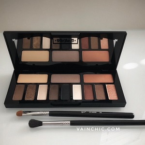
Every so often, it’s fun to change up your makeup look, and using a new eyeshadow palette is an easy way to do that. I usually go for a basic eye look on a daily basis, but I’m still drawn to eyeshadow palettes. Maybe it’s just the gorgeous packaging or the beautiful shades inside, but there’s something about them that catches the eye. Versatile palettes are my favorite- something that offers a nice array of neutrals for everyday and a few unique shades for an evening out.
A few days ago, I picked up the Kat Von D: Shade & Light Glimmer Palette. It is currently on sale at Sephora for just $29 (usually $49). The neutral colors appealed to me, and the glittery shades looked so beautiful and festive, I decided to try it out. I love Kat Von D’s liquid lipsticks but I’ve never tried the brand’s eyeshadows before, so I was excited to start using this palette. I picked up the glimmer palette, but there’s a matte version of the palette available as well. The idea behind this palette is to contour the eyes and create dimension; hence the name Shade & Light. The claims include that the shadows are velvety, buildable, and long-wearing. So far, here are my thoughts on this palette…
PROS
Ingredients: 2 thumbs up for no parabens and no animal ingredients!
Packaging: Beautiful packaging- the case is a sleek, matte black with the trademark KVD lettering in a raised, shiny black finish across the top.
Application: I feel like the satin and contour shades work best for me and have the smoother application of the 4 finishes in the palette. Staying power is decent for contour/satin shades (I like to apply Smashbox Primer on my lids first to help my eyeshadow last).
Shades: Beautiful range of colors that come in 4 different finishes. The sparkly shades really pop in the palette. The 4 finishes include:
Base Satin Shades: Porcelain, Dusk, Dune
Contour Shades: Copper, Cinder, Rust
Define/Glitter Shades: Bronze, Onyx, Jasper
Topcoat/Special Effect Glimmer Shades: Sterling, Glacier, Quartz
CONS
Application: Although they look beautiful in the palette, I was a little disappointed in the application of some of these colors. A few shades apply patchy and aren’t as pigmented as expected, so it takes a little work to build them up. There is definite fallout with the glitter shades, and I felt like the shade Porcelain was particularly chalky compared to the other colors.
Finish: Some of the shades are very close in color so there’s not a lot of variation and you have to be careful that they don’t blend into each other completely. Also, I thought the Topcoat/Special Effect Shades were going to be an iridescent finish, but they are actually more sparkly than iridescent.
CONCLUSION
Overall, I have mixed feelings about this palette. Although I like the products by this brand, this particular palette fell a little short for me. On the positive side, the colors are beautiful and most of the satin and contour shades are silky and apply well. The define shades do add dimension and the topcoat adds a pop of glam for an evening out. On the downside, some of the colors look more pigmented in the palette but have a more understated finish when applied. This could be a good thing if you prefer a more muted look. Glitter is tricky with any eyeshadow, but the fallout was still disappointing. Spraying some MAC Fix Setting Spray on my brush before picking up the glitter shades did help with application and reduce fallout. A few shades apply patchy (Porcelain) and are hard to blend (Jasper). Also, a matte shade in the palette would have been helpful as a transition color.
I’m not planning on returning it, because I still like most of the colors and it was still worth it at the sale price. My advice if you own this palette or want to purchase it, is to use the shades the way they are described. In other words, know the purpose and difference between the Base, Contour, Define and Topcoat shades. The easiest way for me to use the palette is to look at it as 3 quads (left, center, right). Each quad contains a Base, Contour, Define, and Topcoat shade so if you just follow that, the look comes out nicely because the colors within the quad complement each other rather than mixing shades from the 3 different quads.
I wish Kat Von D had included a card with a description of the different finishes in the palette (I had to look it up online) or a card with a couple of looks you can create with the palette (the way Too Faced usually does) because that would help with proper use of the palette. All in all, this is a gorgeous palette which does offer some beautiful colors and can be used to create a glam look. However, it’s important to know how to use the palette correctly, so you can create a defined look using the play on shade and light as intended. I hope this helps and I would love to hear your thoughts/suggestions if you own this palette!
Take care,
Saba


